Roll & Unroll: A Warm, Empathetic Identity for a Therapy Practice
A new therapy practice needed an identity that balanced professionalism with warmth, creating a welcoming experience for children, teens, and families.
Project Overview
Roll & Unroll is a newly launched therapy practice dedicated to improving lives through speech-language and feeding therapy. From day one, the founder knew the brand needed to reflect the heart of the practice: empathy, professionalism, and a warm, welcoming atmosphere for children, teens, and families.
Without an existing identity, the challenge was to create a visual system that introduced the practice with clarity and confidence. It needed to feel friendly enough for young patients, yet mature enough for older clients. A balance that would set the tone for the entire therapeutic experience. We set out to build a brand that conveyed trust, stability, and emotional connection from the moment someone encountered it.
Project Execution
We began by grounding the identity in the practice’s core values: empathy, professionalism, warmth, and a dynamic, patient-centered approach. Since Roll & Unroll was launching from scratch, every design choice needed to establish instant clarity about who they are and the kind of care families can expect.
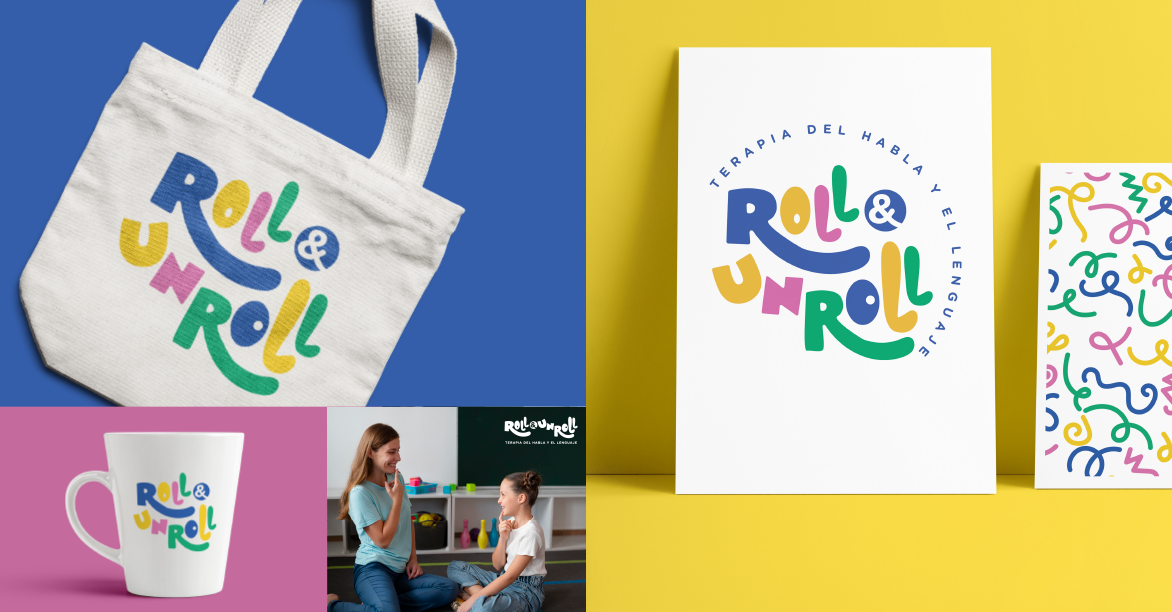
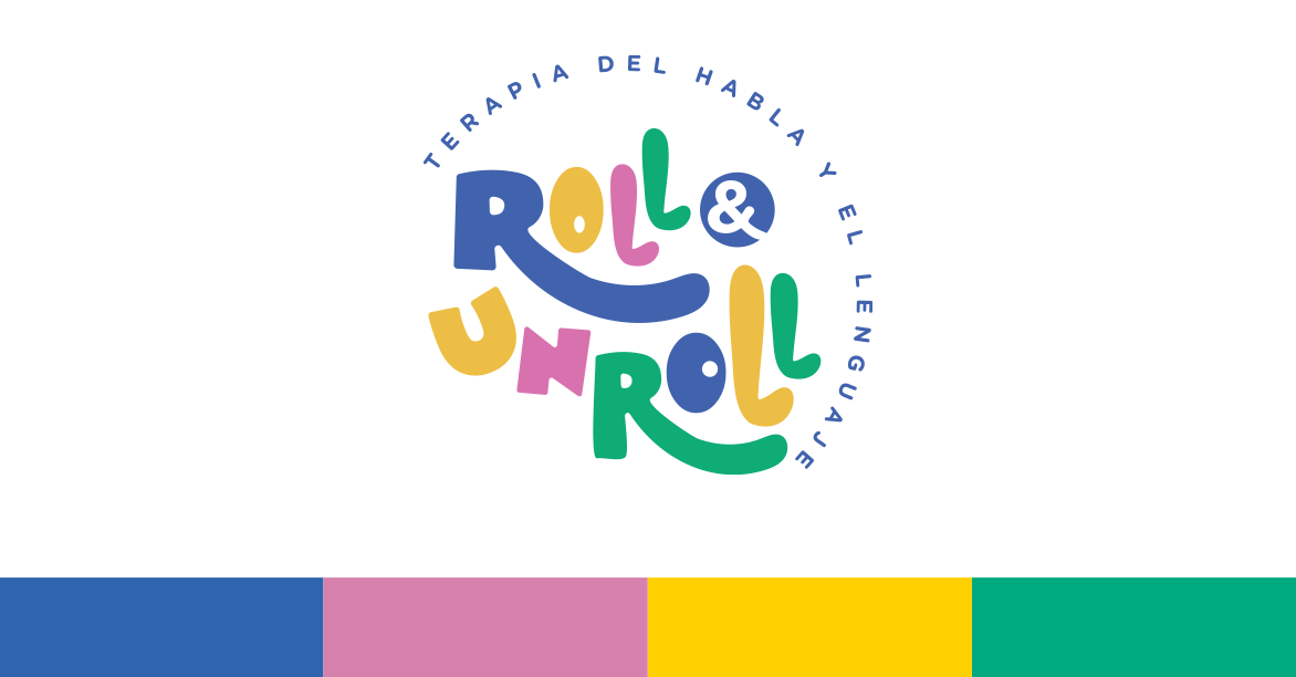
The visual system is built around a balanced, emotionally intelligent color palette. Yellow brings optimism and focus; pink brings warmth and sensitivity; blue adds calm and stability; and green represents renewal and growth. Together, these tones create a therapeutic atmosphere that feels supportive without drifting into childish territory.
The logo uses rounded forms and clean geometry to communicate approachability and trust. Multiple variations ensure it stays legible across signage, digital platforms, clinical documents, and small-format applications. The typographic system, led by Gotham Rounded Bold, strikes the right balance: professional and highly readable, yet warm and human.
Mockups and visual applications helped the founder envision how the identity would show up across the practice, from printed materials to office signage, creating a cohesive and welcoming environment for every patient entering the space.


Project Results
With the new identity in place, Roll & Unroll launched with a clear visual presence that immediately communicated its values and care philosophy. Families described the brand as warm, modern, and trustworthy, exactly the emotional tone the practice needed to establish from day one.
The visual system helped the practice differentiate itself in a field where many therapy brands lean either overly clinical or overly childlike. Roll & Unroll now occupies a space that feels both professional and empathetic, aligning with the founder’s vision of a practice that supports patients of all ages.
The cohesive identity gave the new business a strong foundation for growth, allowing it to build recognition, trust, and emotional connection with patients and families from the very beginning.