Vistabela: A View Worth Branding
Vistabela had the view, but not the identity to match it. We rebuilt the brand around the warmth, calm, and modern character of Isabela’s coastline.
Project Overview
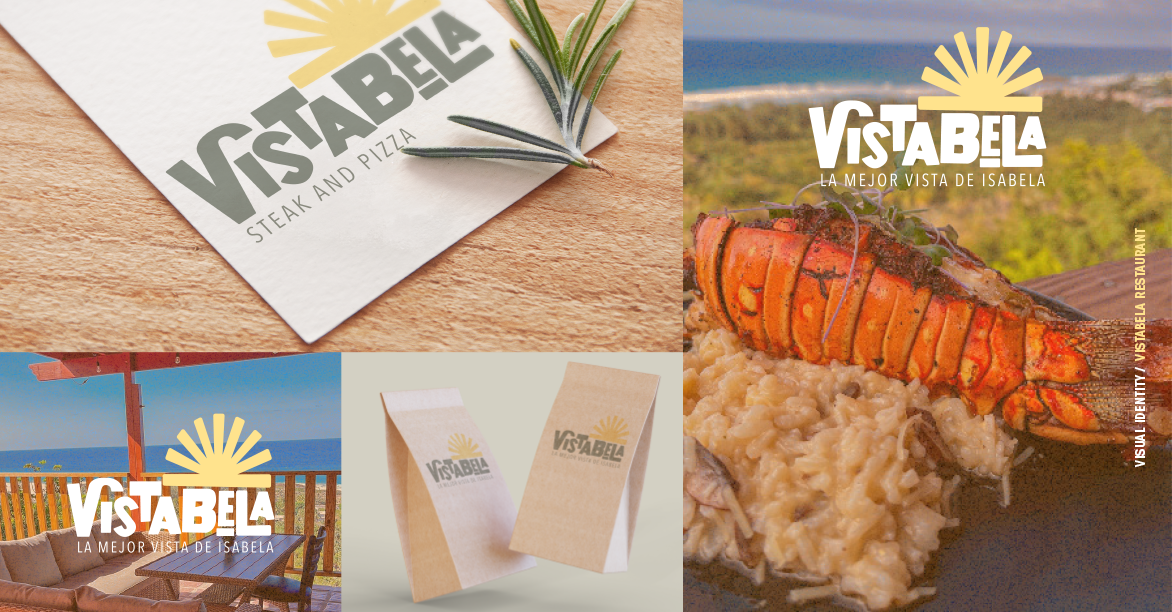
Vistabela had the location and the experience, but the brand wasn’t carrying its weight. The restaurant needed a visual identity that captured its strengths, warmth, family-friendly comfort, and an unbeatable view, while still feeling modern and distinct. We set out to build an identity that didn’t just decorate the restaurant, but positioned it clearly in the minds of locals and visitors.
Project Execution
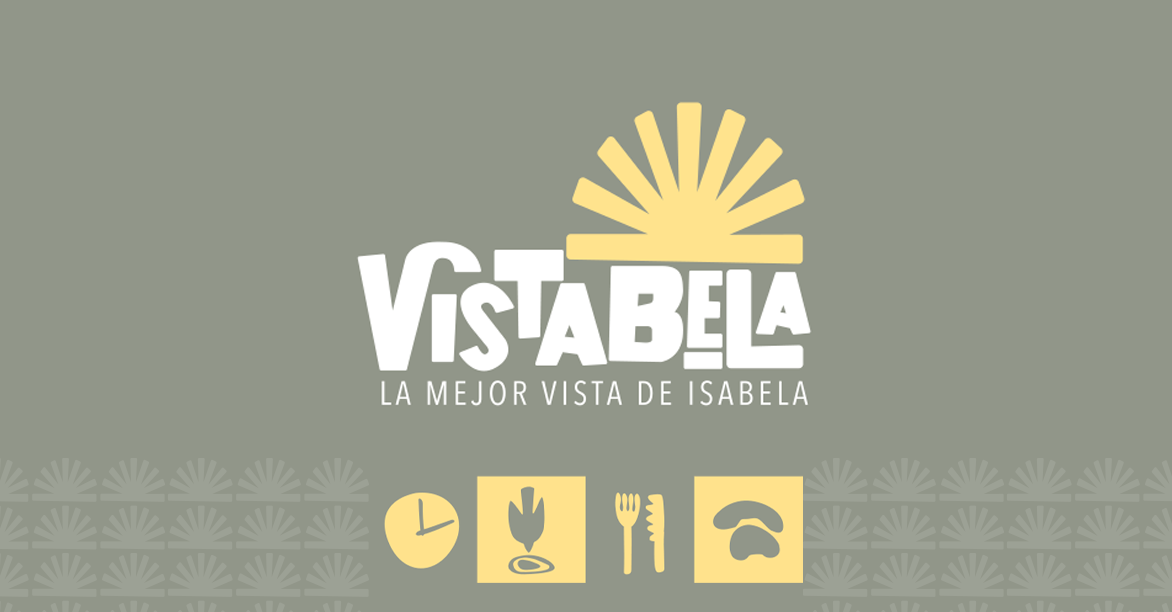
We anchored the identity around a stylized sunset, a direct nod to Vistabela’s iconic vantage point. The handwritten logotype added a relaxed, modern personality, avoiding the typical beach-town clichés. A palette of soft yellow and olive green balanced warmth with sophistication. Every design choice from logo structure to print guidelines was made with clarity and real-world usability in mind. The result was a versatile system that worked as well at noon as it did under the nightlife lights.


Project Results
The new identity gave Vistabela a cohesive and recognizable presence. Signage became clearer, printed materials felt more premium, and customers could instantly connect the brand with the restaurant’s natural strengths. After launch, Vistabela reported improved customer recall, more consistent visual presentation, and a brand that finally matched the experience diners were having on-site. The look now reinforces what makes the place special: the view, the warmth, and the ease of being there.